

At Divante we are developing an open-source PWA (Progressive Web App) eCommerce Frontend App called Vue Storefront. Thanks to this project, we have learned a lot about designing for PWA. Here we share some insights.
Strategy
In Europe and in The USA the typical strategy is to build a separate app for each main function/group of users. Facebook has 16 apps.
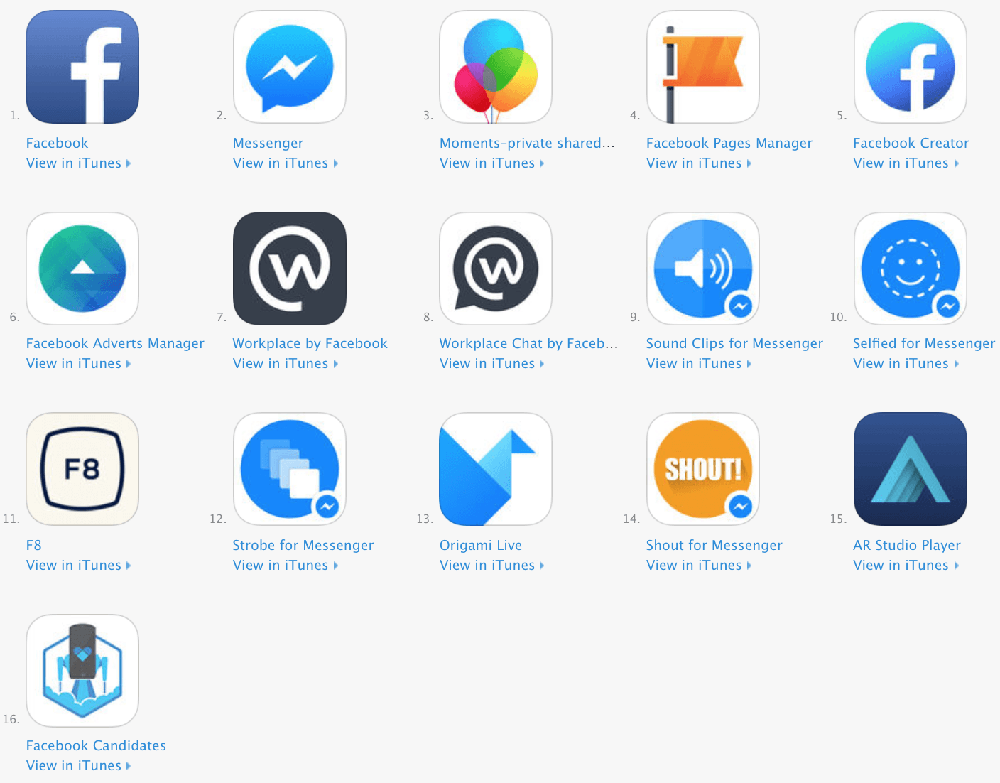
On the other hand, there is only one Facebook website. So the first question is – how many PWAs do you need, and is a one PWA development enough for you?
You can split your websites into subdomains and then prepare a separate PWA for each domain. For example, eCommerce, Product Magazine, Customer Care, etc.
This is all about customer expectations and you should think about this before start. For many businesses there will be only one App of course.
The Team
The most interesting challenge will be to educate your web-team about PWAs and mobile design. A PWA is more like a website from a technological point of view and more like a mobile app from the user experience point of view. So you should think about extending and training your frontend development team.
Approach
It’s good to think about a PWA as a native app when you design it. Users will treat it this way. This is why native apps will be your inspiration and your benchmark. Start from familiarizing yourself with native mobile components.
Avoid web-based UI elements like footers, for example. See how apps show this type of information and use this approach instead.
No Browser = No Safety Net
When a PWA is running in full-screen mode there are no Browser functionalities to help the user. This makes apps look good, but this also creates some risks. Without a Browser, there is no safety net for you – no address bar, no progress indicators, no SSL icon, no navigation buttons. Remember that the back button is the most frequently used navigation element in the web.
You must think about your own navigation. A safe choice is to keep a small and easy to use navigation bar in your app.

Navigation
Users will expect your PWA to behave like a typical app. For example, when they get back to a previous page, you should retain the position of content or listings.
Be careful about rich touch interactions – it’s quite hard to code them very well and a bad implementation can ruin your UX. For sure gestures can’t be the only way of navigating in your app.
Again, a good idea is to keep some simple navigation at the bottom of the screen. This will be your safety net.
Content
Usually, apps show content much better than typical websites. For example, apps use skeletons to show the content positioning even before its arrival. Use placeholders for content while downloading. You can also use low-resolution images while downloading full size versions.
Remember that users may like to share content from an app – allow them to do so.
Cache
Caching is an interesting challenge for your PWA. You can use service workers to run your PWA off-line but you must be careful when you implement eCommerce or transactional websites. You must think about dynamic elements like product availability or promotions. You can, for example, allow users to use your eCommerce app for first 30 minutes without an internet connection and then just inform the customer that there is a risk of product unavailability. You can still synchronize orders later and, in the worst-case scenario, inform user that he or she needs to amend the order due to changes in product availability.
Booting

Remember also that those PWA apps need to boot when they start for the first time. This is something slightly different from apps so you can prepare users for that with some cool UX features.
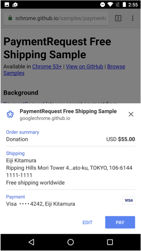
Payment
Mobile abandonment rates exceed 80% when customers are asked to input their credit card details. Recently, Google introduced the payment request API. This eliminates checkout forms and allows merchants to request and accept any payment in a single API call. You can use a mechanism like this to streamline the checkout process.
Touch
Users will expect that touch to work like in an apps. For example, tappable areas should give touch feedback.
Remember that touching an element while scrolling is not clicking but… scrolling. This is quite a common mistake when it comes to mobile websites.
Smooth User Experience
Sometimes you really need to dig deeper to develop an app-like, smooth user experience. This is what Twitter did for a good UX of long lists in their apps.
We implemented our own virtualized list component; it only renders the content visible within the viewport, incrementally renders items over multiple frames using the requestAnimationFrame API, and preserves scroll position across screens. – Twitter
Design
For any PWA it is good to use standard device fonts to make the design more familiar to the user. If you really need to, try to use Images or SVG instead of custom fonts.
Inputs
Ensure inputs aren’t obscured by the keyboard. This is a common problem and can ruin your conversion rate.
Sources
While researching PWA Design, we found some really interesting sources. We used the know-how from some of them to write this article. Feel free to check them:
Designing Progressive Web Applications for the Future
Designing Responsive Progressive Web Apps
5 ways to ensure a great UX for progressive web apps
Introducing the Payment Request API
Designing Great UIs for Progressive Web Apps
Mobile Commerce Trends 2017: Opportunities and Challenges With Statistics
Listen In: Five Mobile Commerce Predictions for 2017
Published May 9, 2018