
Buyers have slowly stopped believing that on Black Friday they’ll find the best deals that can’t be found any other time. If you want to convince them that’s not true, you have to focus on exceptional design and a well-planned promise that will be clearly displayed on your website. If you’re struggling with how to attract attention, interest the consumer, and convince them to make a purchase on your website during this shopping holiday, here are a few strategies.
Prepare yourself for hard work
Gifts for Christmas are usually bought much earlier, and Black Friday should be a day when it’s especially profitable for customers to do so. Brick-and-mortar stores are usually open longer during this day, and retailers organize the best sales and the biggest promotions throughout the year to capitalize on it. Fortunately, your eCommerce store works 24 hours a day, so you don't need to worry about opening hours. However, you have to think about how to prepare your eCommerce properly for every person who comes to shop, which may be even more challenging.
Besides providing great deals, you need to have clear and visible messages about planned promotions so that consumers have no doubts that you’re prepared for the holiday season. There are a few tactics to make your store a real eye-catcher for those customers searching for the perfect bargain for themselves or loved ones.
Custom hero banners on the main page
Custom banners are a great way to attract customers' attention and convince them to buy. The hero can contain information about the current promotion, a special offer, or a purchase discount. Those banners can redirect the user to some of the most popular categories.
The main things to keep in mind are that the hero image needs to be centered, the text needs to be easy to read, and it has to look great on all screen sizes. Unlike the pop-ups, banners might work better because they’re not interrupting your flow unexpectedly. Instead, they’re the main thing you see when you enter the site.
What should the perfect hero banner look like?
Contain a valuable advertising message
Show the user the real benefit that awaits them if they take certain actions. Offer a discount on the selected product or free delivery.
Keep it aesthetic and transparent
A banner should be eye-catching, look good, and be honest. Choose a clear message. Use a simple font, and combine it with a photo.
Add a call to action
Remember to include a large, visible call-to-action button that encourages the user to make a specific action, like "use a discount coupon" or "subscribe to the newsletter."
Test the impact on page loading time
Measure more than just page speed, also measure how your content loads in the browser. Banners can’t extend the loading time of a page. A long loading time greatly increases the bounce rate.
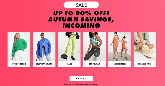
Source: Asos.com
Accessible colors
While designing your website, you also have to consider the accessibility aspect. Find colors that provide maximum contrast between the content and the background. The text should be legible for anyone with low vision or color blindness.
To adapt to accessibility standards, designers have access to a lot of free tools like https://www.whocanuse.com. It's a tool that brings attention and understanding to how color contrast can affect different people with visual impairments. You can check contrast regarding impairments like achromatopsia, deuteranomaly, cataracts, etc.
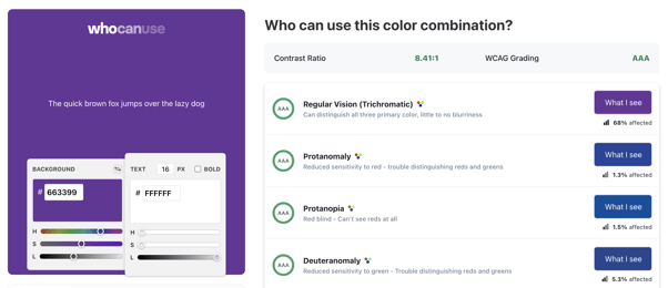
Source: https://www.whocanuse.com
High-quality product content
User experience (UX) focuses on content transparency and placing only the most important information on the product page. A block of boring, overly complex text won’t interest customers. At the same time, remember that a customer needs extensive knowledge about an offer before making a final purchase. First of all, focusing on providing users with comprehensive information about the technical aspects of a product is crucial.
If you have problems with the quality of data with your products, like, for example, they’re incomplete, have the wrong attributes, etc., or if you have multichannel solutions, you need one consistent source of data. In this scenario, the right product information management (PIM) system is something worth considering. A PIM system is an extension of the eCommerce system that allows for more convenient and quicker control over all product data.

Source: https://www.meetsales.io/blog/pim-in-b2b-business
The biggest advantage of using such a system is the ability to supervise the quality of data in the products. You can easily see which of them are completed and which are missing something. If you want to learn more about modern PIM platorms, check out our Headless toolkit.
Tested and analyzed site navigation
A user flow is like looking at directions from point A to point B. It shows the process of customers' points of contact in interacting with a business, such as an experience on the website, a service, a product, or a mix of those things. On-site navigation is crucial because it impacts traffic through search rankings and the lead generation process through conversion rates and usability.
When a user visits your website on Black Friday, they want to find your best deals as quickly as possible. You’ll lose a potential customer if you don’t take care of logical navigation on the site to guide them towards their goal. A lot of eCommerce managers focus on additional UX improvements while forgetting the basics. As a result, many pages still don’t have well-designed site navigation.
If you want to have outstanding performance, you need to remember to optimize your navigation by using analytics, A/B testing, and user tests. Analytics, even though it shows comprehensive data, won't show you all of the context. Embrace the power of your data because it’ll show your site's weaknesses. For instance, you can discover that visitors are skipping the most important pages because of drop-down menus, so you need to avoid them in the future.
A smooth and easy purchasing process
Too long and complicated purchasing processes discourage potential customers from purchasing. A perfect eCommerce transaction should be intuitive and as short as possible. UX design specialists suggest requiring the user to enter only basic personal data in the purchase form. The goal of eCommerce should be to shorten the purchasing process to just a few clicks.
The most common weak spots in the checkout flow in terms of UX are:
- No guest checkout option, which eliminates the quickest way to buy;
- The length of the checkout process;
- No estimated shipping time;
- Few payment options. If the customer doesn’t find the payment method that suits them best, they may not decide to buy;
- Hidden extra costs at the bottom of the checkout page. Any additional costs should be mentioned in advance.
Mobile-first approach
Currently, most people look for information using mobile devices, which is why it’s so important that the design of your online store is responsive to that. A big majority, 60%, of shoppers look for Black Friday and Cyber Monday deals on mobile devices. Responsive website design is no longer an option but a must.
Adjusting websites to mobile-first is not only important due to the UX but also in terms of ranking on Google. Google considers if the website was designed with mobile devices in mind and favors those that do in the search results.
3 tips on how to leverage modern mobile design:
Personalize
The best method to personalize mobile UX design is to use a questionnaire that would contain questions related to name, gender, age, or location at the time of sign-up. After that you can create customized content.
Skip buttons when it’s not necessary
Mobile users are taught to use movements, like swiping, and that’s now more intuitive and quicker for them than clicking a button.
Care about readability
When designing an unforgettable design for any device, don’t forget about legibility and honesty with your copy.
Add proper tags
Buyers often make decisions based on an impulse. By adding a tag or sticker with “sells out quickly” or “a few pieces left,” you can help them decide.
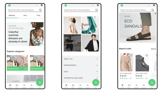
Source: https://www.behance.net/gallery/136987903/Storefront-UI
Pages with specific elements only for Black Friday
Besides new banners, pages, or discount signs, refresh existing elements to let your visitors fully immerse themselves in the holiday atmosphere. You can change the header, footer, or even logo for a while. You need to tap into their shopping mood.
Black Friday landing pages are a gateway to making a purchase. This is the page where you present your offer in the best light possible and persuade visitors to click the “buy” button.
What do you have to remember while creating your Black Friday landing pages? Show your customers how much they’ll save, keep the copy short and to the point, include seasonal imagery, and focus on having an overall clean and straightforward layout.
Find out what UX problems are affecting your revenue
Conducting a website health check is vital to determine how digital products align with your UX and business goals. Our marvelous Product Design Team can analyze your eStore by combining the customer’s point of view with the technology matrix. A UX audit verifies the site's performance by considering users, best practices, and technology standards. It gives you clear directions on optimizing your UX and improving your results.

Lights, Camera, Action
Remember that not everybody wants to buy something on Black Friday and Cyber Monday, and people are becoming skeptical of the offered promotions. Your main task is to build trust, create an amazing website experience, and give your customers some extra care during this holiday season.
Here are your takeaways from this article:
- Prepare aesthetic, hero banner with a clear message.
- Keep your content transparent and place only the most important information on the product page.
- Take care of logical navigation and use analytics to see your site's weaknesses.
- Check the length of the checkout process.
- Leverage modern mobile design.
- Create specific design elements only for Black Friday.
This article is another one in a series that Divante will be publishing about Black Friday and Cyber Monday on our blog. If you are interested in this topic, stay tuned for more.
Published September 22, 2022